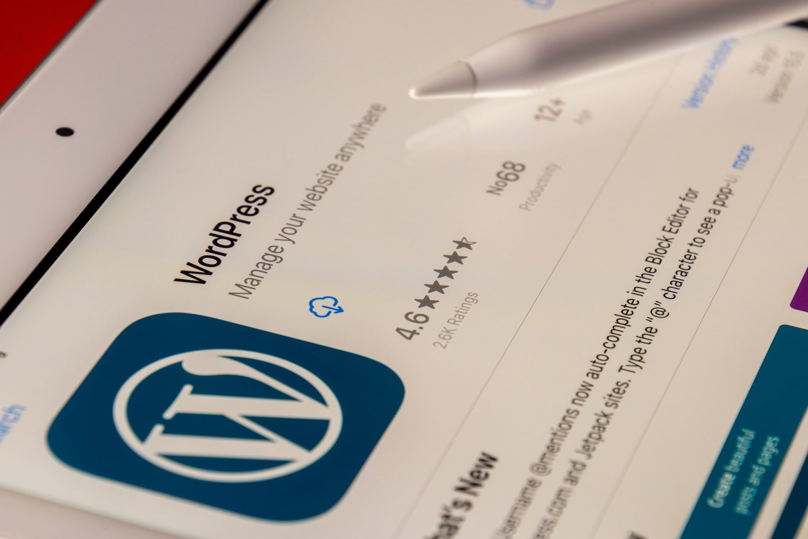
Posts

How to Convert Your WordPress Website into HTML

WordPress is a popular platform for creating and managing websites. However, there may be instances where you need to convert your WordPress website into HTML. Converting your website into HTML can offer several advantages, such as improved website speed and security, reduced server load, and the ability to host your website on any server without requiring PHP or a database.

In this article, we will guide you through the process of converting your WordPress website into HTML. Please note that this process requires some technical knowledge, so if you are not comfortable with coding, it is recommended to seek assistance from a professional.

Step 1: Back up Your WordPress Website

Before making any changes to your website, it is crucial to create a backup. This will ensure that you have a copy of your website in case anything goes wrong during the conversion process. There are several WordPress plugins available that can help you create a backup of your website.

Step 2: Export Your WordPress Content

To convert your WordPress website into HTML, you will first need to export your content. WordPress provides an export feature that allows you to download an XML file containing all your posts, pages, and other content. To export your content, go to the WordPress admin dashboard, navigate to the ‘Tools’ menu, and click on ‘Export.’

Step 3: Convert Your WordPress Theme into HTML

After exporting your content, you will need to convert your WordPress theme into HTML. This involves extracting the necessary HTML, CSS, and JavaScript files from your WordPress theme. You can do this manually by accessing your theme files via FTP or by using a specialized plugin that automates the conversion process.

Step 4: Modify Your HTML Files

Once you have your theme files in HTML format, you may need to make some modifications to ensure that your website functions correctly. This may include updating file paths, removing PHP code, and fixing any broken links or references. Additionally, you may want to optimize your HTML files for better performance by minifying the code and compressing images.

Step 5: Upload Your HTML Files to a Web Server

Once you have modified your HTML files, you can upload them to a web server of your choice. This can be any server that supports HTML files, as you no longer require PHP or a database to run your website. You can use FTP or a file manager provided by your hosting provider to upload the files.

That’s it! You have successfully converted your WordPress website into HTML. It is important to note that converting your website into HTML means that you will no longer have the dynamic features offered by WordPress, such as automatic content updates or user comments. However, if you have a static website that does not require frequent updates, converting to HTML can provide significant benefits.

How to style second last items in a list?

Please use following CSS syntax to style the second last element in a list or group.

<style>
  .list-number-123 {
    list-style: none;
  }

  .list-number-123 li:nth-last-child(2) {
    background: #edeaea;
    color: #30a960;
    font-weight: 700;
    padding: 10px;
  }
</style>

<ul class="list-number-123">
  <li>Item 1</li>
  <li>Item 2</li>
  <li>Item 3</li>
  <li>Item 4</li>
  <li>Item 5</li>
  <li>Item 6</li>
  <li>Item 7</li>
</ul>
  • Item 1
  • Item 2
  • Item 3
  • Item 4
  • Item 5
  • Item 6
  • Item 7

How to extend number of DIVI columns (more than 6)?

Step 01: Include the below CSS to theme options

/* Custom Columns */
.ten-columns .et_pb_module {width: 10%; float: left;}
.nine-columns .et_pb_module {width: 11.11%; float: left;}
.eight-columns .et_pb_module {width: 12.5%; float: left;}
.seven-columns .et_pb_module {width: 14.28%; float: left;}
.six-columns .et_pb_module {width: 16.66%; float: left;}
.five-columns .et_pb_module {width: 20%; float: left;}
.four-columns .et_pb_module {width: 25%; float: left;}
.three-columns .et_pb_module {width: 33.33%; float: left;}
.two-columns .et_pb_module {width: 50%; float: left;}

@media (max-width: 980px){
  .ten-columns .et_pb_module {width: 20%;}
  .nine-columns .et_pb_module {width: 33.3%;}
  .eight-columns .et_pb_module {width: 25%;}
  .seven-columns .et_pb_module {width: 33.33%;}
  .six-columns .et_pb_module {width: 33.3%;}
  .five-columns .et_pb_module {width: 33.3%;}
  .four-columns .et_pb_module {width: 50%;}
  .three-columns .et_pb_module {width: 33.33%;}
  .two-columns .et_pb_module {width: 50%;}
}
 
@media all and (max-width: 767px) {
  .ten-columns .et_pb_module {width: 25%;}
  .nine-columns .et_pb_module {width: 33.33%;}
  .eight-columns .et_pb_module {width: 25%;}
  .seven-columns .et_pb_module {width: 33.33%;}
  .six-columns .et_pb_module {width: 50%;}
  .five-columns .et_pb_module {width: 33.33%;}
  .four-columns .et_pb_module {width: 50%;}
  .three-columns .et_pb_module {width: 33.33%;}
  .two-columns .et_pb_module {width: 50%;}
}

@media only screen and (max-width: 479px) {
  .ten-columns .et_pb_module {width: 50%;}
  .nine-columns .et_pb_module {width: 50%;}
  .eight-columns .et_pb_module {width: 50%;}
  .seven-columns .et_pb_module {width: 50%;}
  .six-columns .et_pb_module {width: 50%;}
  .five-columns .et_pb_module {width: 50%;}
  .four-columns .et_pb_module {width: 100%;}
  .three-columns .et_pb_module {width: 100%;}
  .two-columns .et_pb_module {width: 50%;}
}

Step 02: Add the relevant class to your row, depending on the number of columns needed.

Step 03: Remember to only keep one column in the DIVI row settings and use DIVI modules as columns. That’s it Happy Coding!

How to center a div vertically and horizontally using CSS?

Centered DIV element

Please use following method to align any content vertically and horizontally centered..

<title>Vertical and horizontal center align div</title>
<style>
  .container-box {
    background: #efefef;
    max-width: 1080px;
    min-height: 500px;
  }

  .centered-div {
    display: flex;
    flex-direction: column;
    align-items: center;
    justify-content: center;     
  }

  .box {
    background: #ccc;
    text-align: center;
    padding: 50px;
  }
</style>
  <div class="container-box centered-div">
    <div class="box">
        This element is horizontally and vertically aligned to center!
    </div>
  </div>
Vertical and horizontal center align div
This element is horizontally and vertically aligned to center!

How align an absolute positioned div relative to the max-width of contents?

The following CSS code will align the absolute positioned div inside a container.

Note: This will only work depending on the max-width of the container. Need to adjust for mobile devices.

<!Doctype html>
<html>
<head>
  <style>
    .page-body {
       max-width: 800px;
       background: #ccc;
       position: relative;
       display: flex;
       flex-direction: column;
       align-items: center;
       padding: 100px;
     }
    .page-container {
       max-width: 500px;
       background: #eee;
       display: block;
       padding: 20px;
    }
    .abs-position {
       position: absolute;
       top: 50px;
       right: calc((100% - 500px)/2 + 0px);
       padding: 20px;
       text-align: center;
       border: 1px solid #ccc;
       border-radius: 10px;
       background: #a5f6c0;
       width: 200px;
    }
  </style>
</head>
<body>
  <div class="page-body">
    <div class="page-container">
      <h1>Page title</h1>
      <p>Lorem Ipsum is simply dummy text of the printing and typesetting industry. Lorem Ipsum has been the industry's standard dummy text ever since the 1500s, when an unknown printer took a galley of type and scrambled it to make a type specimen book. It has survived not only five centuries, but also the leap into electronic typesetting, remaining essentially unchanged. It was popularised in the 1960s with the release of Letraset sheets containing Lorem Ipsum passages, and more recently with desktop publishing software like Aldus PageMaker including versions of Lorem Ipsum.</p>
    </div>
    <div class="abs-position">I am positioned absolute!</div>
  </div>
</body>
</html>

Page title

Lorem Ipsum is simply dummy text of the printing and typesetting industry. Lorem Ipsum has been the industry’s standard dummy text ever since the 1500s, when an unknown printer took a galley of type and scrambled it to make a type specimen book. It has survived not only five centuries, but also the leap into electronic typesetting, remaining essentially unchanged. It was popularised in the 1960s with the release of Letraset sheets containing Lorem Ipsum passages, and more recently with desktop publishing software like Aldus PageMaker including versions of Lorem Ipsum.

I am positioned absolute!

How to create WhatsApp share button in HTML

<a href="whatsapp://send?text=http://intelyblog.com/" data-action="share/whatsapp/share" target="_blank">
   <span class="fa fa-whatsapp"></span> Share on WhatsApp</a>

Share on WhatsApp